

Create Store!
Step by Step Store Set-up
Here is the order that store setup will be discussed:
- Step 1. Enter all the information needed for the various modules you want to enable
- Step 2. Enable and organize the modules
- Step 3. Specify store colors
- Step 4. Final adjustments if any
- Step 5. Related Information
Let's take a look at the menus on the Administration Page pull-down tabs to see which ones we need for the Store Layout:
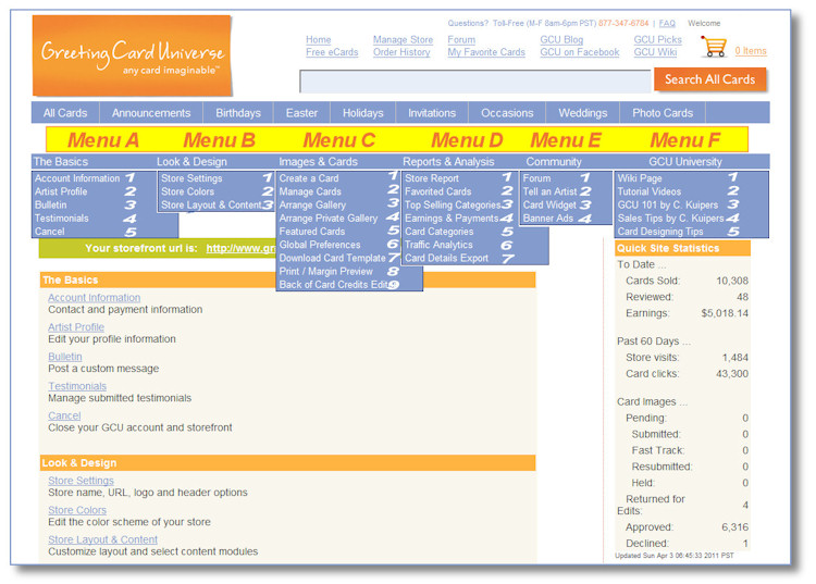
Step 1 - ENTERING INFORMATION
- Menu A2 - Artist Profile
- Display Name - This 25 character field will be the name displayed on your storefront, in emails, and on the back of your cards (if enabled through Menu C8)
- About Me - This text field is available if you would like your visitors to know a little bit about you.
- Interests - This text field is available if you would like your visitors to know a little bit about your interests, generally as it relates to your artwork.
- Artist Picture - This 200p x 200p maximum jpeg image will be used in your store, and in the GCU Forum.
- BOC Picture - This 200p x 200p maximum jpeg image will be used on the back of your cards (if enabled through Menu C8).
- Menu B1 - Store Settings
- Name of Store - This required text will be displayed on each page of your store and on the back of your cards (if enabled through Menu C8)
- Store URL - This required text is added after the slash in http://www.gcuniverse.com/ to define your unique store URL. It should be your store name with no spaces. A-Z, 0-9, hyphen and underscore are acceptable characters. ONCE SET THIS CAN NOT BE CHANGED SO PLEASE SET IT ONCE CORRECTLY.
- Logo for Header - This is an optional 950p x 150p maximum jpeg image for your store. It can be located left, centered, right, or hidden. Some artist's have found the 945p x 149p image size to be clearer than the fully dimensioned image on some monitors.
- Header Text - This optional text is located in the banner area underneath the logo/header image (if enabled).
- Background Image - This is an internet address (URL) to an optional background image (i.e.: JPEG that will appear like wallpaper underneath your store. Your store is approximately 1000 pixels wide so the wallpaper image of, for instance, 250 pixels square would be tiles 4-across.
Step 2 - ENABLE AND ORGANIZE THE MODULES
- Menu B3 - Store Layout and Content
- First, click your selection to have the Wide Column either LEFT or RIGHT on your page.
- Second, place a checkmark in the checkboxes for the modules you decided earlier that you wanted for your page. The SEARCH and the PRODUCT GALLERY modules are the only ones that are required and are pre-checked.
- Third, place your cursor over each enabled module, one at a time, and while holding down the left mouse button, drag the module into the position you want on the page. Do this for each module. The result will be the configuration of these modules in your store.
- CRITICAL - MAKE SURE TO CLICK THE SAVE BUTTON IN THE LOWER RIGHT SIDE OF THIS PAGE or else none of your selections will be saved
Step 3 - SPECIFY STORE COLORS
- Menu B2 - Store Colors
- You can either use a one of the 7 Pre-Set color scheme or create your own scheme. The pre-set schemes have well-matched color combinations for module text, header text, and module backgrounds.
- Pre-Set Schemes - Simply click on one of the 7 color blocks to preview the scheme. If you would like to use one of these schemes click the SAVE button and you're done.
- Custom Color Scheme - Use the BACKGROUND tab to custom select the colors for each of the 4 background areas. A color palette is provided to help in the selection process. The color code uses the standard X11 colors in hexadecimal format as described HERE.
- Custom Module and Text Colors - Use the MODULE tab to select the colors for the Module text, background, and borders. A color palette is provided to help in the selection process. The color code uses the standard X11 colors in hexadecimal format as described HERE. CAUTION: The Module Border size should not be altered from 1 as it can negatively impact the arrangement of cards.
- You can either use a one of the 7 Pre-Set color scheme or create your own scheme. The pre-set schemes have well-matched color combinations for module text, header text, and module backgrounds.
Step 4 - FINAL ADJUSTMENTS Your goal is to provide a nice store for your visitors. This suggests having a clean arrangement of modules, a pleasant looking storefront, and easy to read text. Card shoppers come to buy your cards, so try to draw their attention to your products and less so to you or to other in-store distractions.
Here is a list of common problems that can lead to card buyers leaving your store quickly:
- Store that does not look finished - such as no banner or welcome message
- Text hard to read because it is too light or too dark relative to the background color
- Poor store color combination, not welcoming to the eyes
- An poorly made or positioned store banner
- No artist information. They are in your store partially to learn about who you are, like they would an author of a book
- Search box in the lower half of the page requiring them to scroll repeatedly to use it
- Long list of testimonials taking away attention from your cards
- No way for them to contact you if desired
Step 5 - RELATED INFORMATION
- Customization using HTML code - It is possible to add HTML in the Header Text, Welcome, and Artist Profile modules. It is best to avoid this as it can impact how the page will look with some browsers, however some artists have had success adding links, tables, and other information using HTML in these areas. There are numerous discussions in the GCU Forum Artist Chatter area on use of HTML in store modules.
- Links outside GCU - Although not prohibited currently, adding links from your GCU store to other sites is generally a poor practice as it likely causes lost sales. Shoppers come into your store to buy a card, so it is generally considered better to not give them the opportunity to click-out easily. You want to keep them there to make a purchase.