

GCU Marketability Standards Policy
On the heels of our recent landmark of reaching 500,000 cards in July 2011, it is due time for GCU to turn an honest and critical eye to our existing collection and new cards. To date, GCU has accepted virtually all submitted work and artists. Today we are introducing a Marketability Standards policy. Based on GCU’s evaluation of marketability and commercial appeal, GCU will begin saying “no thank you” to cards.
The Marketability Standards and Guidelines will raise the bar on card designs to increase professionalism and marketability and ultimately a better experience for our shoppers. This will up the overall product quality on GCU which reflects on all artists in our community as shoppers view GCU as a single store. Our goal is to provide a selection of greeting cards to the buying public that are competitive, professional, and equal to the highest level of design.
Although we’d like to say this process will be clear cut, objective and quantitative, in practice that is quite impossible. By nature it is subjective and heavily qualitative. However here are some of the elements that we have established as standards and guidelines that our reviewers will be looking at.
| Marketability Guideline Areas | Examples (in process) |
| Subject Matter: poor, random, unrelated, not professional |
REASON: Card is not professional looking. Poor mix of photo and graphics.
REASON: Poor quality pet photo. Reason sent to artist when this card was declined: The photo of the dog is not only blurry but contains distracting elements in the background that are telltale signs of a home snapshot. It seems the shading effect of the purple background is used to try to mask or correct the poor background of the photo. Although he/she's adorable this pose perhaps isn't the best to be used for sale. Compare your photo to this one for example which has the background snipped out, not blurry and clear eyes and no distracting accessories (scarf). |
| Image Quality – clarity, color, lighting, angle, cropping, shadows, composition, misuse of filter, out of focus, exposure, particularly with photographs |
REASON: Photo is not professional looking, with baseboard showing in the background and poor lighting.
REASON: Photo is not completely in focus, unfortunately!
REASON: Plain. Lacks good lighting. Nothing jumps out. Like many others.
REASON: Snapshot images should look professional, with appropriate lighting. REASON: Snapshot iImages should look professional, and have no distracting background elements. |
| Misuse/overuse of filters - Artists should use a light hand hand with filters. There are many tutorials on the Internet on the use of the various filters available. Filters are not intended to be used in their default settings; it often takes a lot of tweaking and the use of more than one filter to achieve an attractive image. A filter will not save a bad photo. |
|
| Overused Image - | |
| Unrelated Image - not related nor appropriate to occasion/category, gender, relation, age, etc. | |
| Any Reason - on a case by case basis we reserve the right to not accept a card considered to be lacking in commercial appeal |
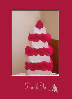
REASON: The composition and photograph will not produce a quality greeting card. Distracting and unprofessional background elements and shadows. Poor composition (cake is not centered). Digital designs are not polished. |


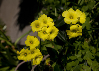


FLOWERS - Problems to avoid
|
|
|
|
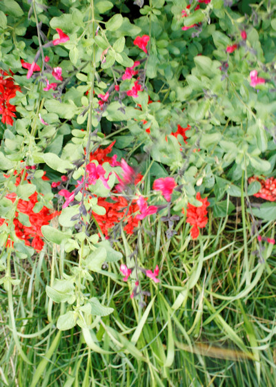 No Subject No SubjectNo Wow Factor Looks like weeds Lighting is flat Basic snapshot |
 Distracting sunlight in upper right corner Distracting sunlight in upper right cornerRose is too centered (Would suggest the rose be off center for more appeal) Lighting is flat Too much negative space surrounding the subject flower |
|
|
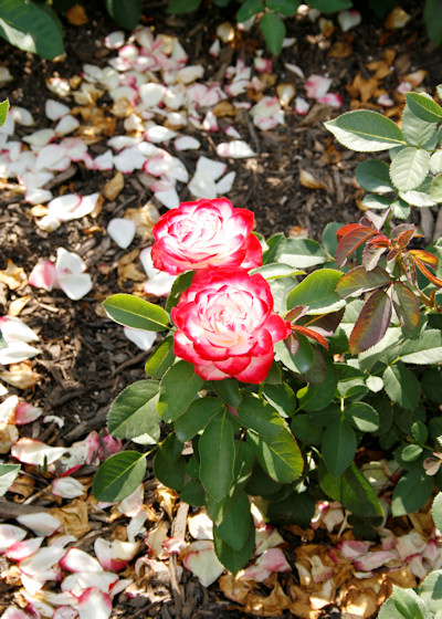 Subject flowers are too centered Subject flowers are too centeredDistracting dead flower petals on ground This could have been a much better photo as a close up without the dead petals on the ground Bright sunlit leaves are distracting |
 Lacks Interest
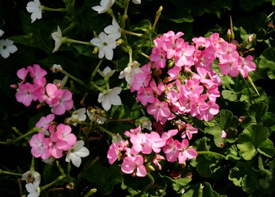
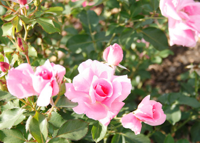 Distracting pink flower in upper right corner of background
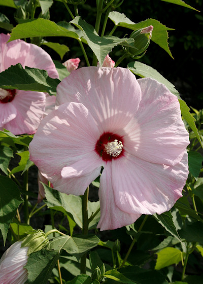 Flower front is shaded
 Lacks a main subject
 Bad Snap Shot
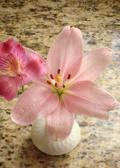 Lighting is flat and underexposed
Problems to avoid - Before and After (Flowers)
Negative Element 1 = Harsh shadow under the flower Negative Element 2 = Muddy background which should have been white. Positive Element 1 = The flower is nicely lit. |
Note the changes to the shadowing and background.
|
Other - Problems to avoid
Not Marketable |
Unacceptable Image |
Unacceptable Image |
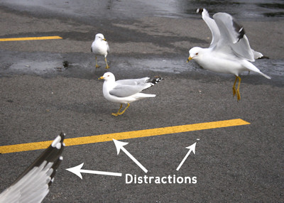
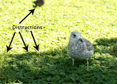
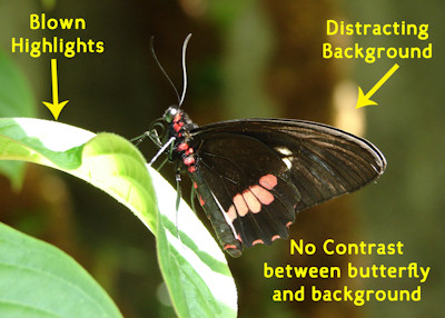
PHOTO CARD MARKETABILITY GUIDELINES
1. Be creative, compositions should use creative and appropriate framing/treatment around or enhancing the photo. Specifically: Photo area should serve as the focal point of the overall design. Compositional emphasis should be on the photo, not other elements on the card. In other words, the design shouldn’t look like the artist took an existing greeting card, and shoehorned a photo on it. Preferably, smaller photo areas should be framed in a way that makes sense with the rest of the design. Shape of photo area, if not generic (circle, square, rectangle) should be in keeping with the purpose of the card (for example, a Christmas tree shaped area on a Valentine’s Day card would be in error).
2. Maximize the photo size as the focal point. Specifically: Entire photo area (a single photo or multiple photos) should ideally use 1/3 to 1/2 of the card’s surface. Exceptions will be made for exceptional designs.
3. NOT a one size fits all approach. If design is used to create multiple cards, elements should vary and be appropriate by occasion, age, relation, gender
See this Special blog post on Custom Front Photo Cards.
Before and After example
PHOTO CARD Not Marketable
|
 Photo has a frame Good correlation of photo frame and the card text Card has a specific purpose |
The review team will begin to apply these standards to newly submitted cards. No cards will be grandfathered in. GCU will also begin weeding through existing cards and saying “no thank you” to those deemed not marketable. Ultimately the direction is for new artists to submit sample work for evaluation before opening a GCU storefront.
This is an excellent time for all artists to look at their body of work with a critical eye as well. Schedule your own “Weed out Week” where artists look at their own cards and remove those designs that you feel do not reflect your best work or do not shine with professionalism and polish. The biggest concerns will be those images of poor quality (blurry, poor lighting, unrelated subject matter, snapshots of household items, distracting/unsavory background items, etc.) Consider using your family and friends and peer artists as honest and frank critics and participating in the GCU Community BLOG Critique Clinic.
Please note, the bar of quality and professionalism that we are setting is not too high and can easily be achieved w/o professional training.
We realize many artists will not be happy about this new policy. This is another corner for GCU and artists to turn and we will all feel the growing pains. However we are confident that this is a fair and necessary step as GCU grows and strives to be the leader in online paper greeting card sales.
Helpful links:
Photo Tips by Artist Doreen Erhardt.
Photographing Pets by Artist Peggy Mundell and Photographing Animals by Doreen Erhardt
Photography Tips for the Beginner by Artist Sheryl Kasper
Photographing Flowers by Artist Doreen Erhardt
The Fundamentals of Focusing Techniques by Artist Doreen Erhardt
Marketability tips in the Community Blog